PradoHealth
PROJECT SPECS:
Time: 1 week
The Team: Shannon Lee
My Responsibilities: UI Designer/Developer
Tools & Skills: brand, mood board, 60-30-10 rule, color theory, color symbolism, style guide, visual hierarchy, A/B testing, Figma, UI design
Downloadable Slide Deck PDF1 • The Problem
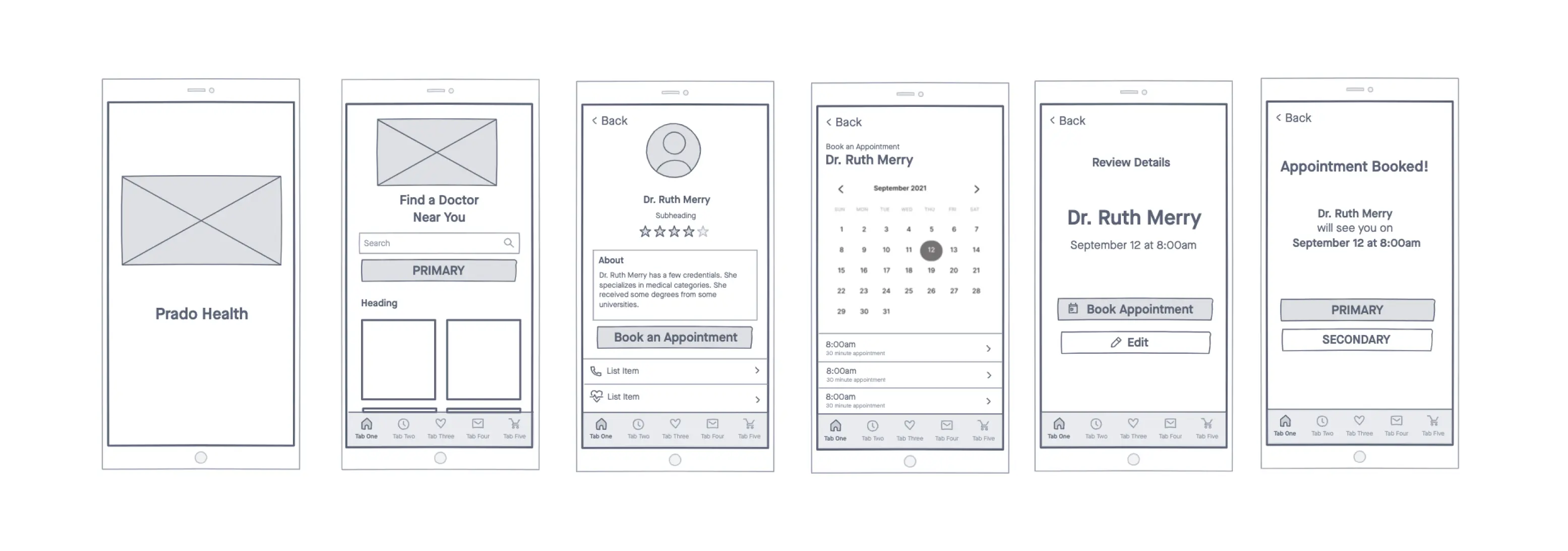
Prado Health is creating an application to help customers search for doctors in their area and book appointments.
The goal: make users feel comfortable and welcomed - not like they're sick or in a hospital.
2 • Research & Ideate
“Hi, we're Prado Health.
We believe in community well-being. At Prado, we believe that good health is a fundamental right for every person, and our mission is to enable easy access to quality healthcare for every member of our community.”
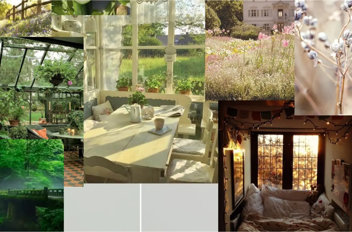
What kind of look and feel are we going for?
Since we DON'T want the user to feel like they're sick or in a hospital, I wanted to focus on the recovery and wellness aspect.
I associate home and nature with concepts of cleansing, healing, and comfort.
noun. grassland / meadow-land /pasture / meadow / prairie / field
3 • Style Guide
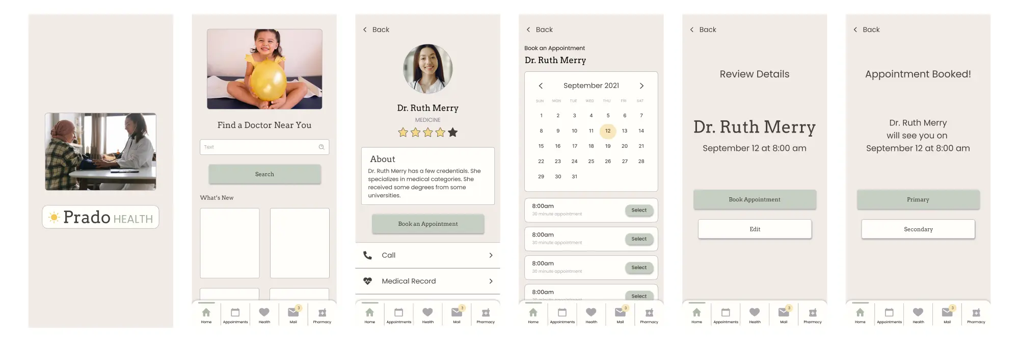
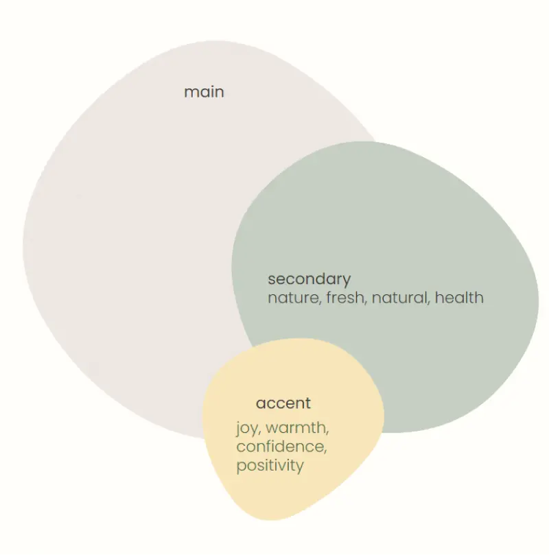
When choosing colors from the mood board, I leaned towards the warmer colors: a warmer beige, a warmer green, and a light yellow.
I also desaturated the colors, to create a relaxing feel. I thought that if the colors were too bright, it could cause some anxiety to the user, or at least some tension.
4 • Testing
Success metric: Confirm was that the colors and font were comfortable and calming.
What adjectives do you think of when looking at these colors and the fonts?
- Calm
- 90s vibe
- Not anxious
- Antique
- Old
- Rustic
The overall feel of the colors was calming. What stood out the most to me was the 'sage' description, since this word can mean different things, but all of the definitions are related to calmness, healing, and wisdom.
5 • Prototypes
6 • Final Takeaways
- I did not strictly follow the 60-30-10 rule.
- I used a lot of white for legibility purposes, to the point where my secondary color is used as frequently as an accent color.
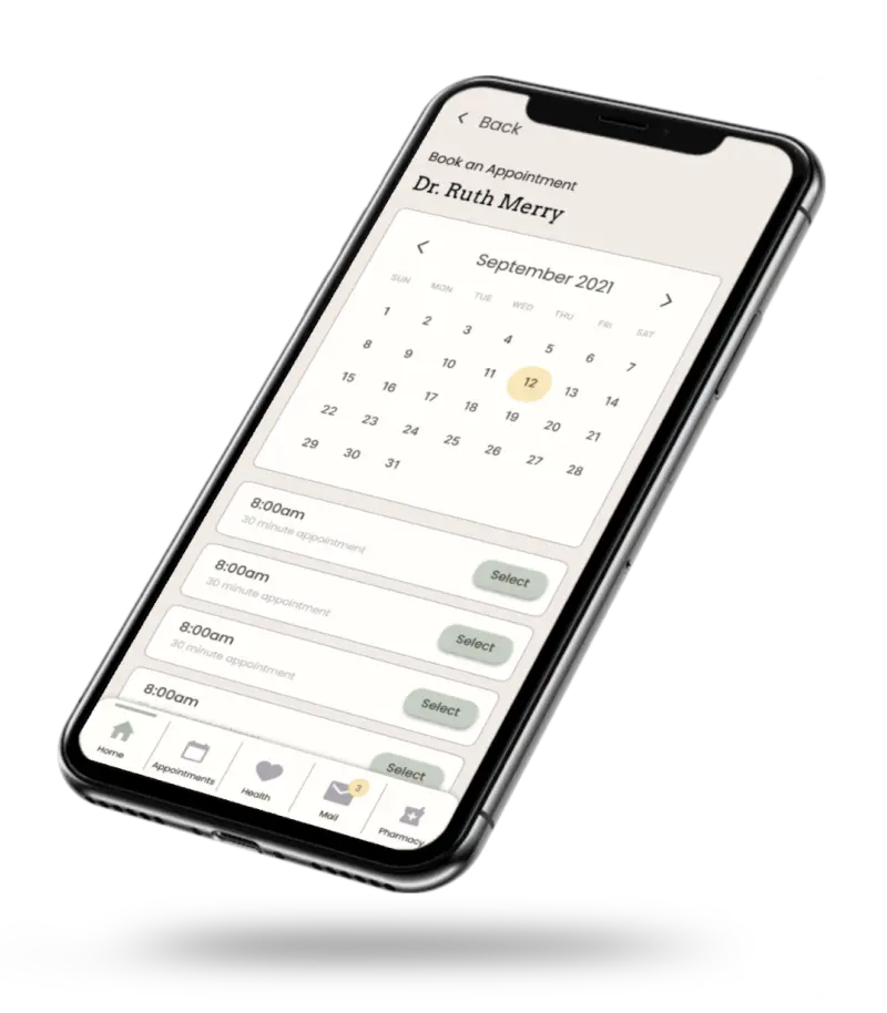
- I tested many different combinations to make it follow the 60-30-10 rule; however, I always went back to these prototypes. I didn't want the users to feel pressured to press the primary button (when it was colored with the accent yellow)
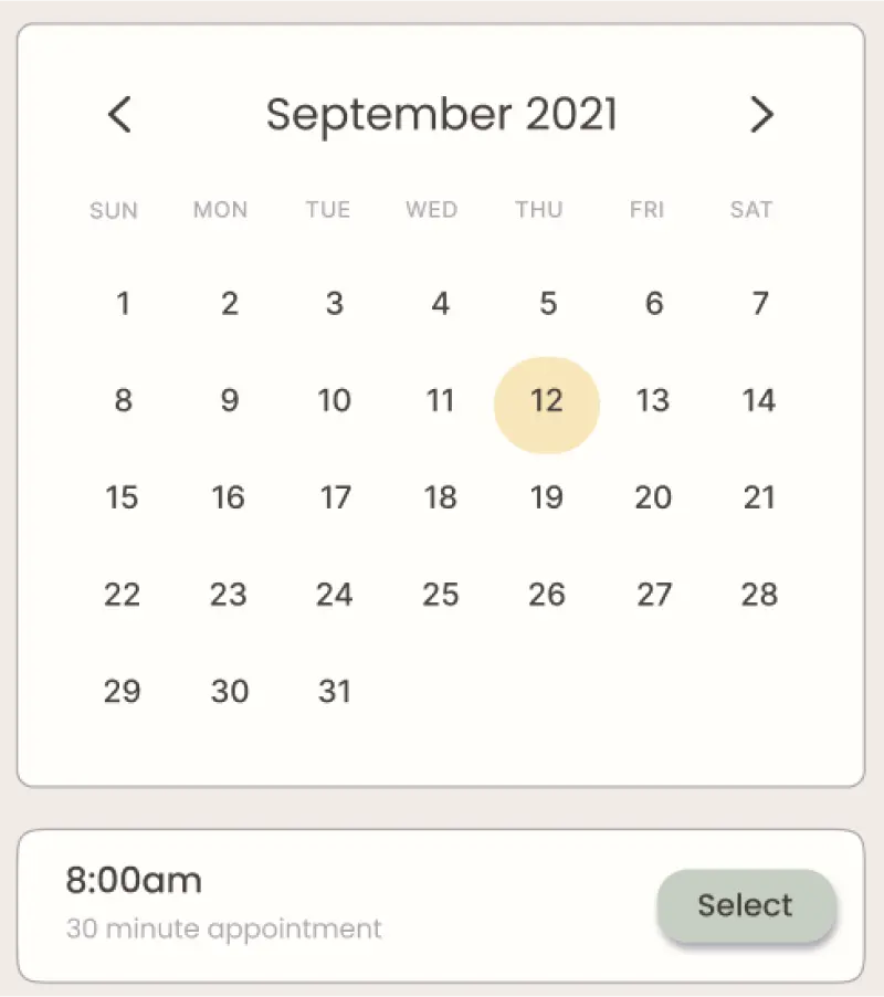
For example: the user must select the date (yellow) before choosing an appointment time (green)
