Nom Noms
PROJECT SPECS:
Time: 5 weeks
The Team: 4 UI/UX developers (including myself)
My Responsibilities: Project manager, Facilitator, UX Researcher, UI Designer
Tools & Skills: user interviews, user surveys, proto-persona, creative matrix, competitive analysis, user journeys, Figma
Downloadable Slide Deck PDF1 • The Problem
Since the pandemic, food applications and food delivery has become extremely popular.
However, there is a lack of communication between the buyers and sellers in the food industry, which leads to frustration in the whole process.
A social media application with the goal of connecting restaurant owners and their customers in a personalized way.
2 • Empathize
What are the pain points of our target audience?

Business Owners
- Lack of technological experience
- Extra fees that come with signing up with food apps

Customers
- Extra fees
- Security concerns
3 • Define
We interviewed 4 target users (ages 25-33) who uses food delivery frequently in their life, and 1 restaurant owner. In addition, we sent out a survey on social media that received 36 responses.
I want to understand how to connect both sellers and buyers in order to alleviate any losses and frustrations on both ends caused by 3rd party applications in the food industry.
All 5 interviewees had no issues with the cost and the extra fees, and were willing to pay for the cost of convenience.
However, 77.8% of our survey takers (general population) said they were discouraged from getting food delivery due to the additional fees.
From this, we realized that we were thinking about our user wrong. Users that do not care about cost will get food delivery, and users that do care will simply not get food delivery.

Our interview questions were focused on the wrong thing, which was caused by an assumption in our research objective.
We were looking into problems regarding food ordering applications specifically, but we what we needed to know was about the whole process of getting food from restaurants.
4 • Reassessment
- How often do you eat out? Motives?
- Do you try new restaurants?
- How do you discover new restaurants? What are your motivations?
- How often do you order food online?
- How easy or difficult is the process? Why?
- What are your major pain points?
From the new Google survey, we narrowed down the problem to two points:
Getting people to discover new restaurants
Restaurants can't reach out new customers directly (communication issues)
HOW MIGHT WE provide a food driven experience with open communication for a cost-conscious seller and buyer in order to intuitively and effortlessly connect one another?
5 • Ideate
We created a matrix focused on costs, communication, user security, and the ordering process, and spent some time coming up with ideas for solving or improving these main concerns.
Best Features to Incorporate:
From our user research findings, the #1 importance is pictures of the food (from other customers), and discovering new restaurants from friends
We wanted the user experience to be a lot more interactive and exciting, and focused on the communication and connection. We also wanted a way for the restaurant to market themselves with no cost.
The team voted and decided to create a social-media type application that is photo focused, so that users can connect with each other and with restaurants.
6 • Prototyping

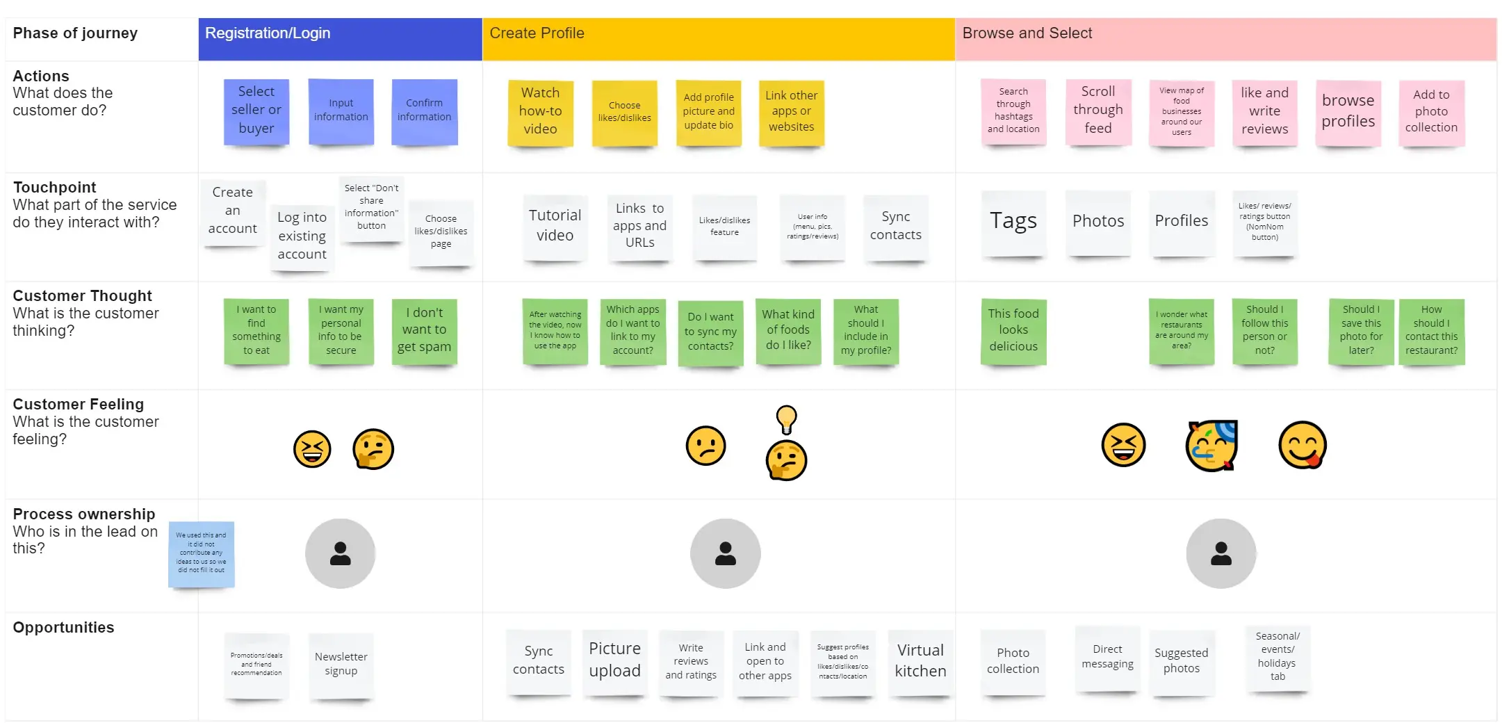
Registration/onboarding, Customize profile, Browse feed and restaurants
7 • Testing
- Discover a new restaurant
- Leave a review with a picture
- Change user preferences
- How fast can the user complete the task?
- How intuitive is the process? How many clicks does it take for the user to complete the journey?
- Icons were not intuitive to our users
- Layout was confusing
- There were options and features that the users were completely uninterested in
- All users were able to complete the tasks completely, within our success metrics.
8 • Final Takeaways
This isn't linear
Our team made an early mistake of letting our biases lead our questions, which ended up in wasted time and resources poured into research. We were able to quickly detect our mistake through our data and go back to empathize phase. In addition, we constantly had to go back and forth between prototyping and testing in order to deliver a user experience we were confident in.
validation Through Research and Testing
It's so easy to let our individual life experiences influence the way we approach problems. However, this can be combated through defining those edge cases and backing up our design decisions with data and testing.